JIF

SPREADING JOY WITH JIF

Created at Soulsight
Creative Direction, Chloe Donovan + Eric Warning
Contribution, Packaging

A classic American brand thats stood the test of time. Jif hasn’t touched their logo for over 30+ years. They weren’t intrested in leaving their legacy behind, but instead evolving to fit in the modern shelf. With wellness brands popping up, Jif wanted to remind consumers of the OG packed protein snack - peanut butter.
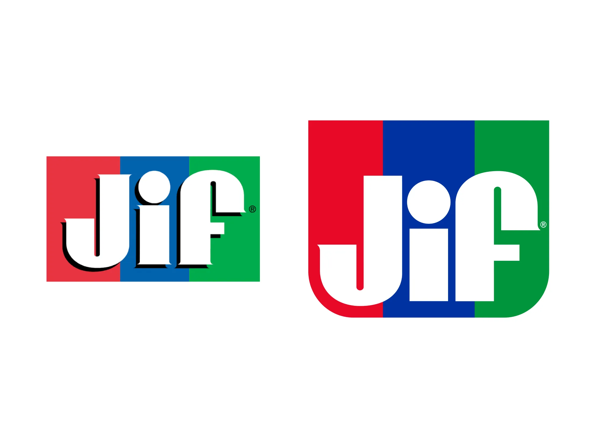
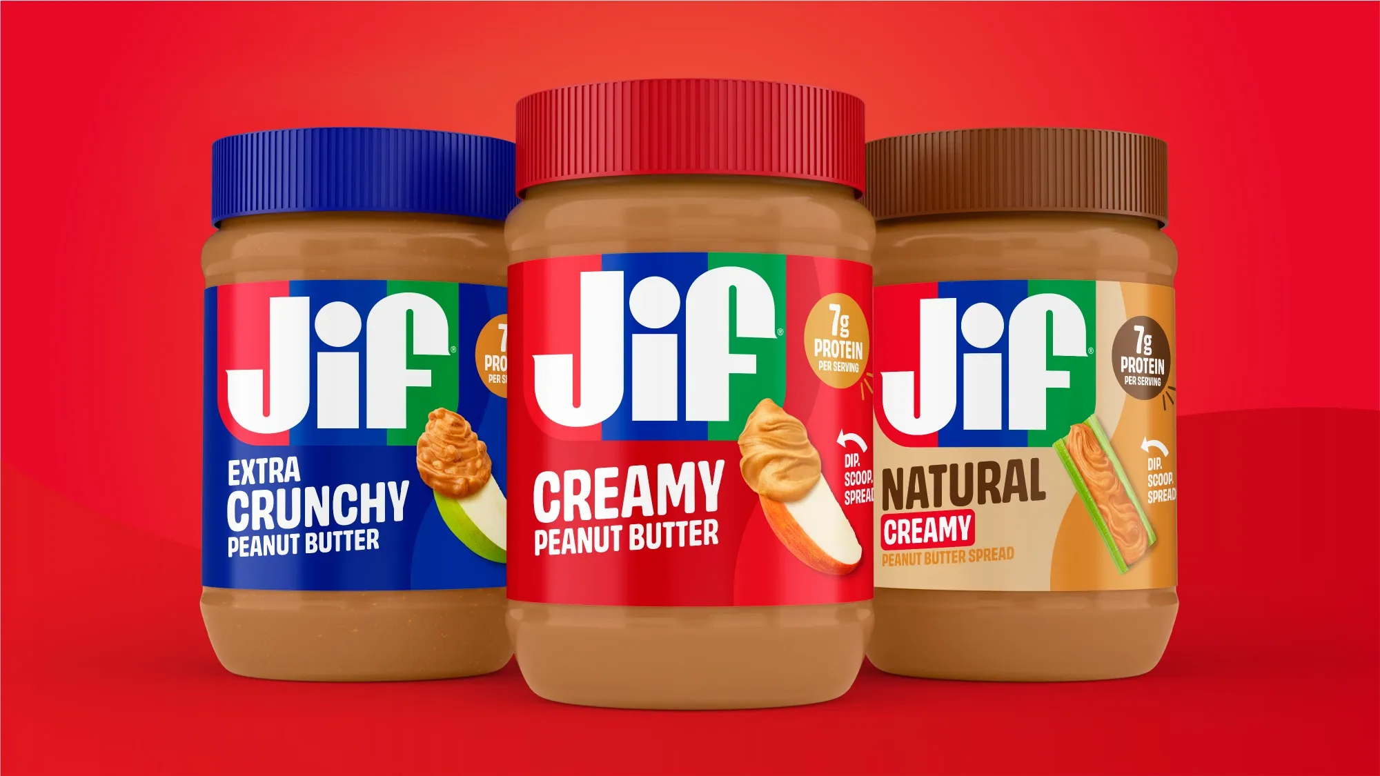
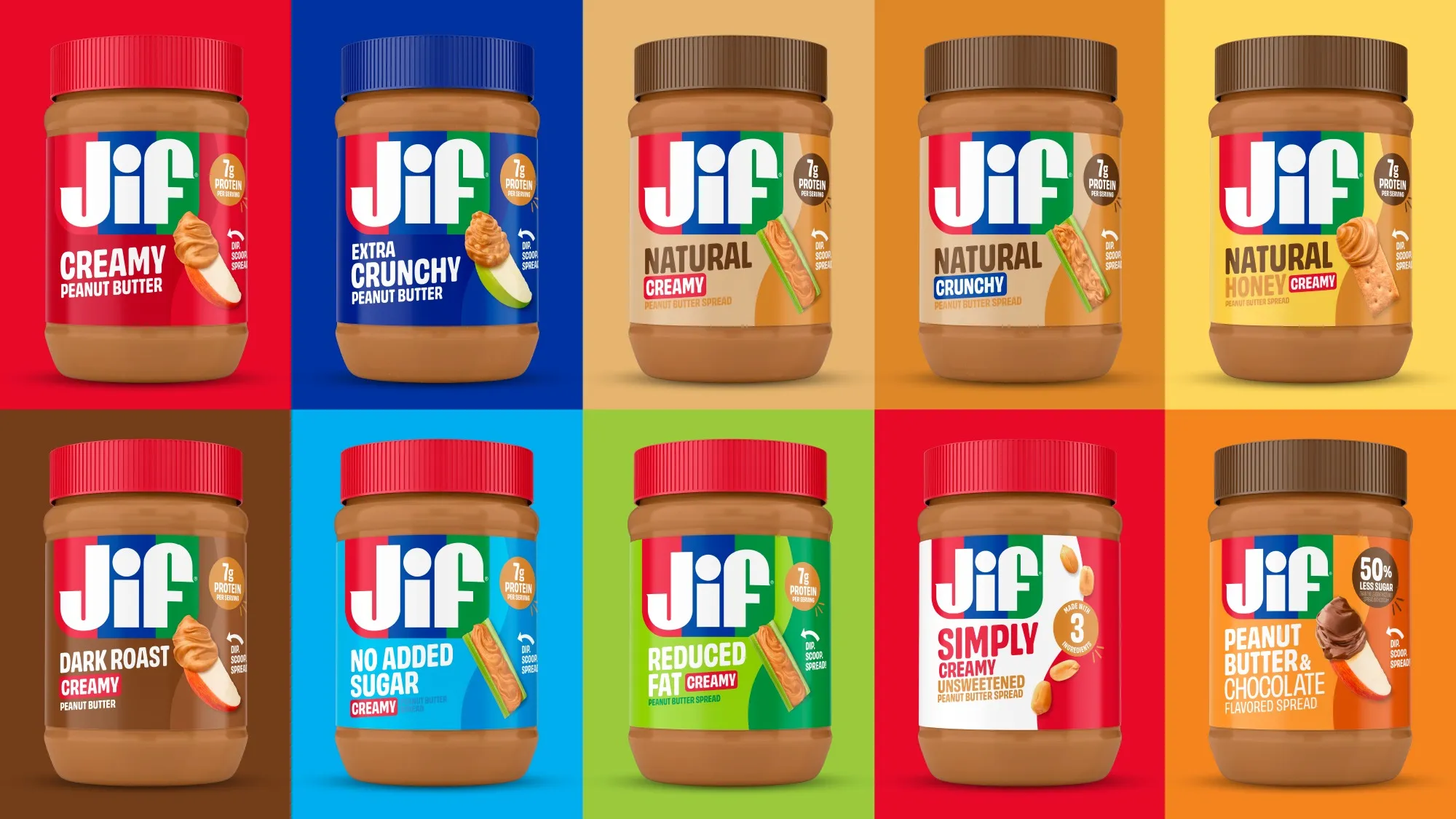
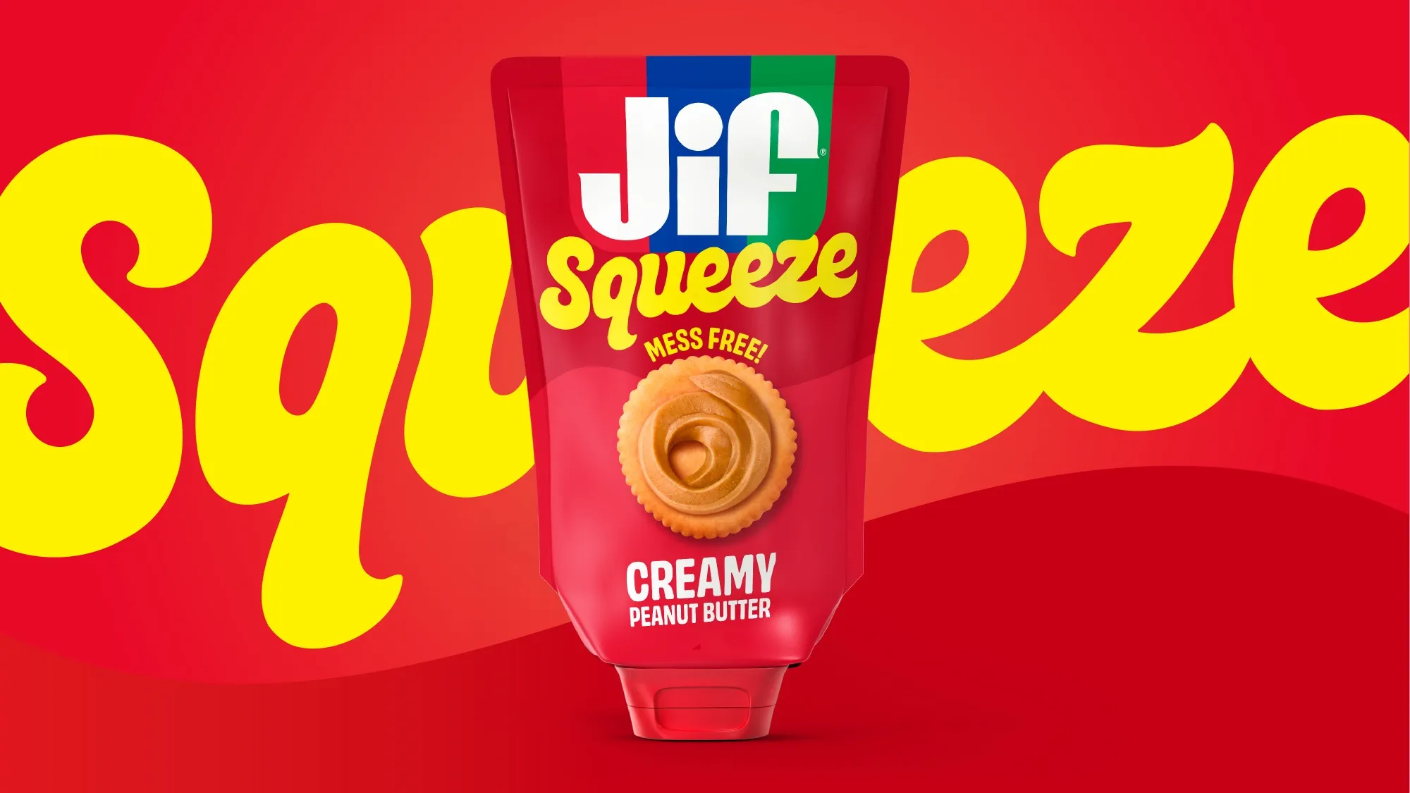
Modernized the brand by ditching drop shadows, punching up our color palette, and cleaning up some serifs. Introducing the apron holding shape to our logo brings form and order to a packed protfolio. This shape gives us a clear start and stop when the logo used to flood on older packaging. We're left with a mark that feels distinctly Jif - without changing too much.
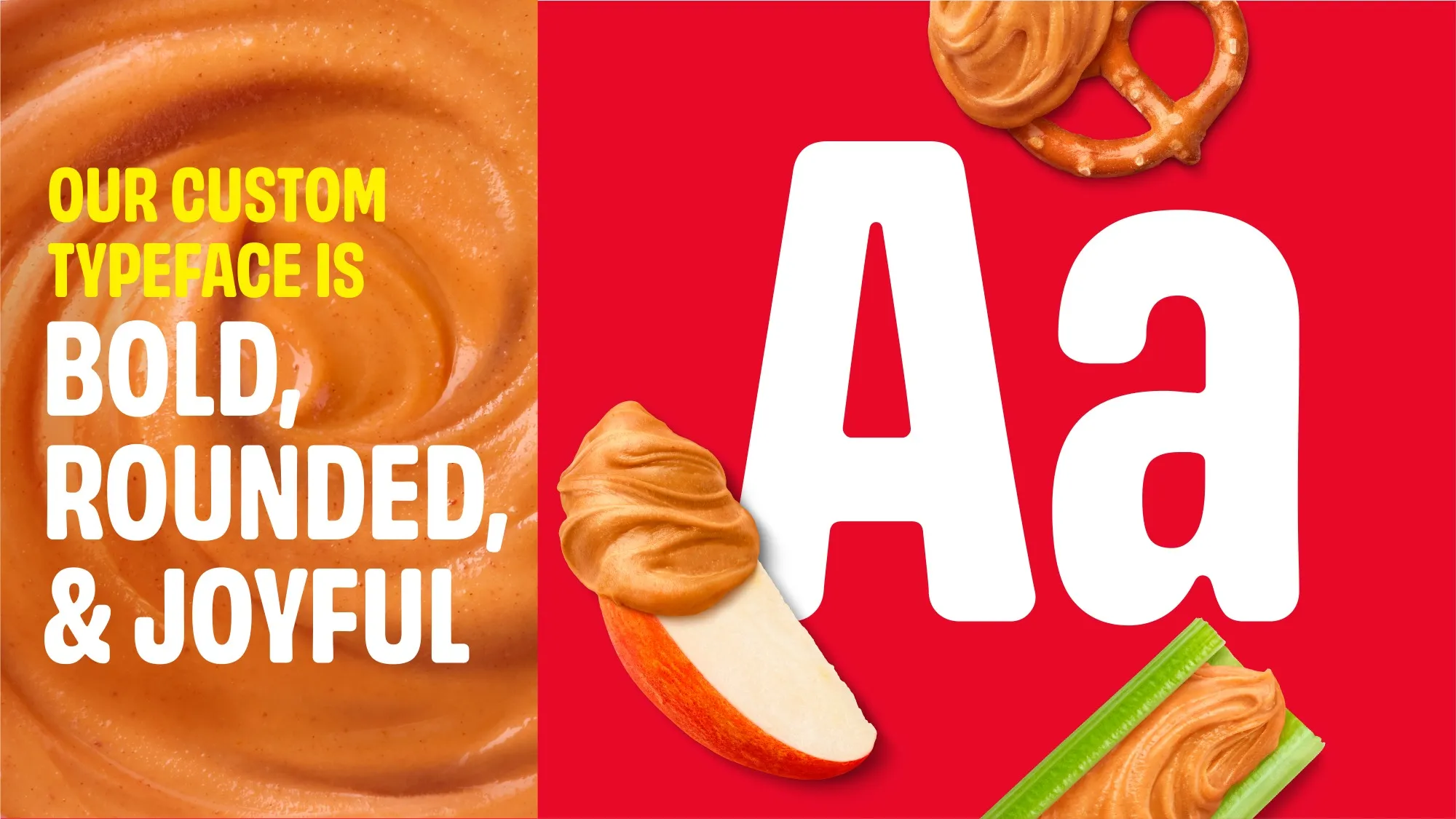
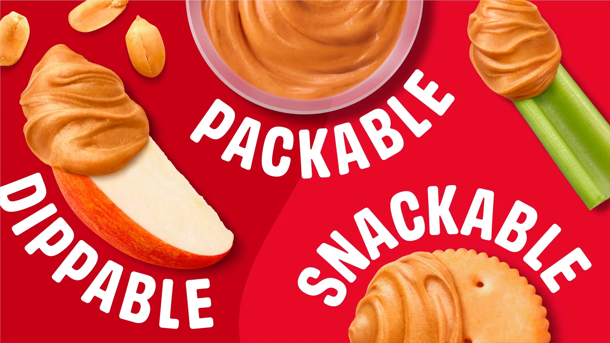
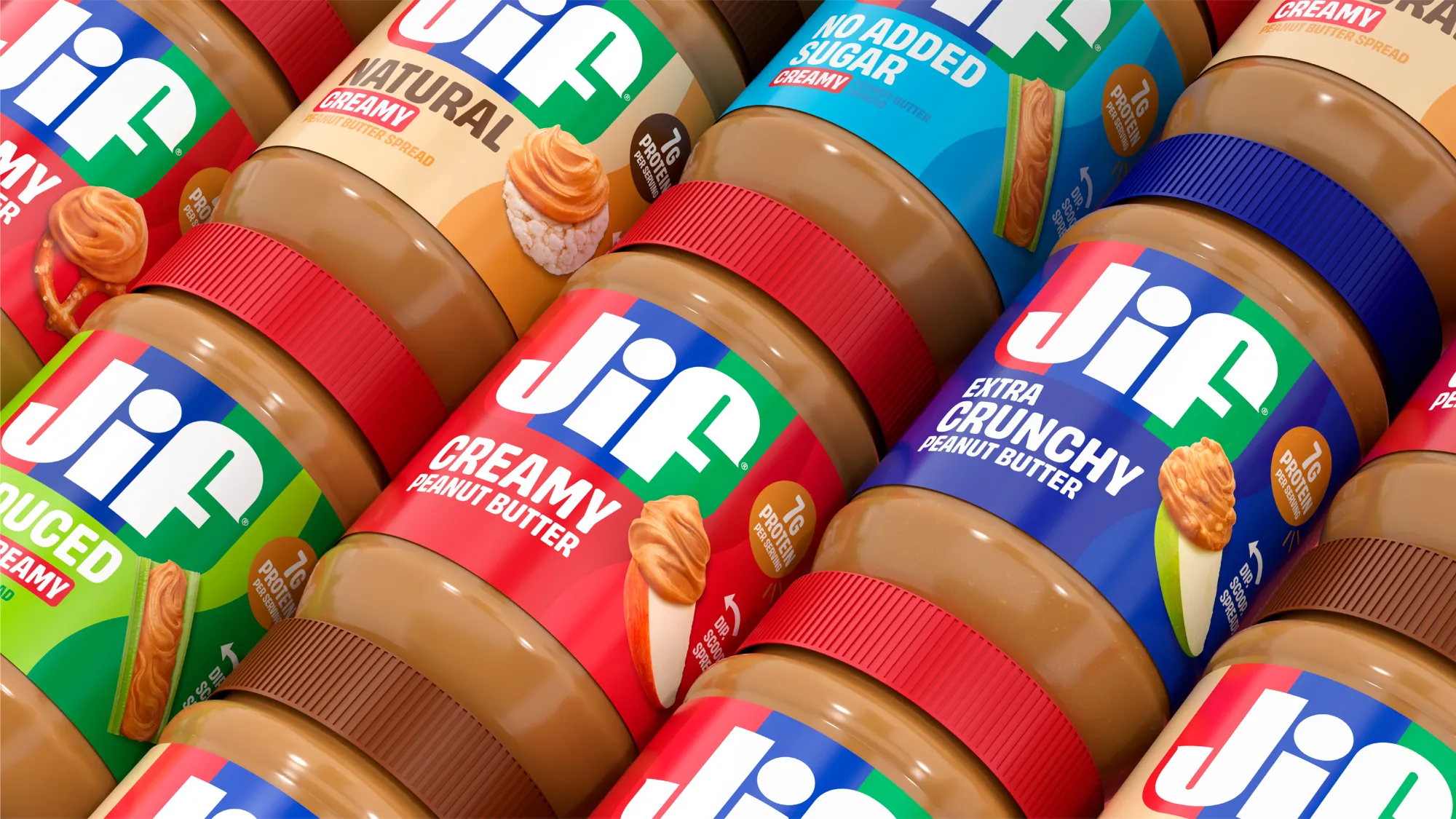
Our system leans into color to help shop the growing offerings from Jif.  A new addition to our packs are featured boldly to show each jars texture and remind consumers that Jif can be enjoyed outside of the PB+J. - accompanied by our playful signoff  'Dip.Scoop.Spread'.

Next project

SIMPLY SPIKED